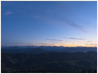
I thought it was time to do another edit run-through, in case anyone's interested in that sort of thing. I do 99% of my post-processing using an all-in-one editor called ON1 Photo Raw 2021, it's a great programme that covers a lot of the functionality of Lightroom and Photoshop in one package.
 |
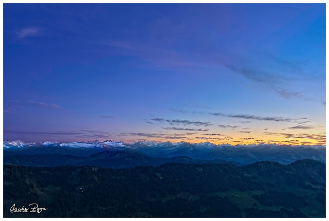
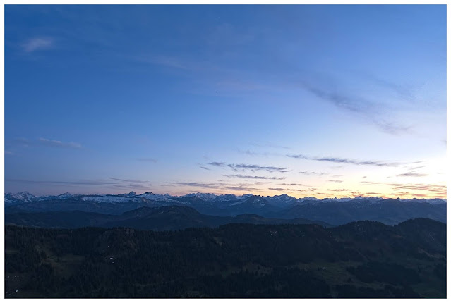
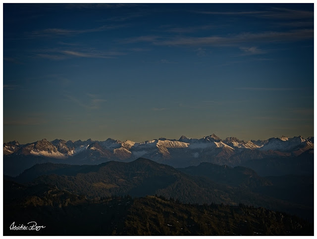
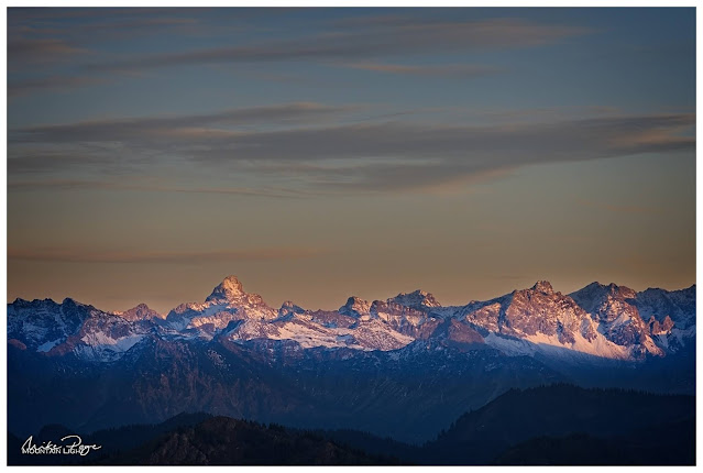
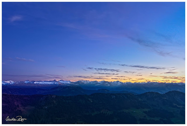
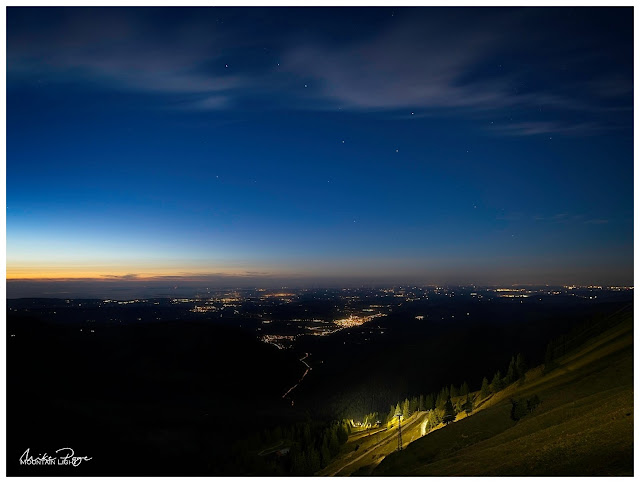
| Blue Hour over the Allgäu last Saturday |
Talking to friends, I have the impression that for a lot of photographers, post-processing is a book with seven seals and something that they'd rather not bother with. To be fair, a lot of cameras produce excellent quality jpegs, but what a lot of people don't realise is that a jpeg isn't an unprocessed image: It's an image that has been processed by your camera (or RAW editing software) using automated algorithms.
So the question is - who do you want to edit your digital negative? your camera or other automated processing software, or yourself? If you're happy with the edit your camera/software has made, then there's not a lot of need for further editing. If, on the other hand, the jpeg out of camera doesn't meet your expectations, or more importantly (for me at least), if the final photo doesn't convey the emotion that you experienced in the field, the only solution is to get to grips with digital processing. That's deep isn't it? And that's the principle underlying most of my editing; I want to convey to the observer the emotion that I experienced when I took the photo.
HDR Assembly
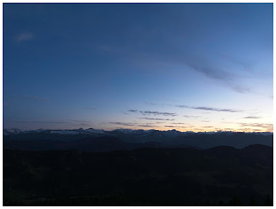
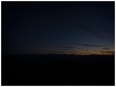
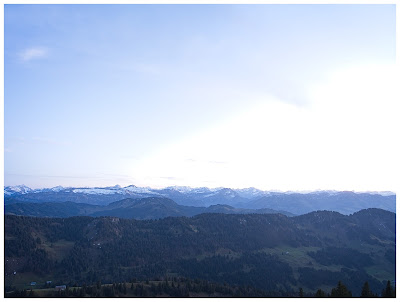
This photo is a high dynamic range (HDR) image. It has been assembled from three separate exposures taken one after the other; one exposed as normal, one for the dark parts of the scene and one for the bright parts of the scene. The camera has a much lower capacity for distinguishing between the brightest and darkest parts of an image for the human eye. Conservatively, my eye is 30x more sensitive to extremes of light and dark than my camera sensor is. To compensate for this, it's necessary to take multiple images and compact them together in order to arrive at a compelling image.
 |
| Base Exposure; 12 mm, f/8, 0.6 s, ISO 200 |
 |
| Dark: ibid with 1/13 s |
 |
| Light: ibid with 5 s |
Normally I would set the camera to expose two stops over and two under for 1/4 and 4x the brightness (one stop= one doubling or halving of the exposure). Here I elected to use a three stop bracket due to the extreme conditions. The three base images are nothing special, as you'll see here. The basic image is exposed for the sky, the darker image has more colour in the brighter sections of the sky and the lighter one for the valley foreground.
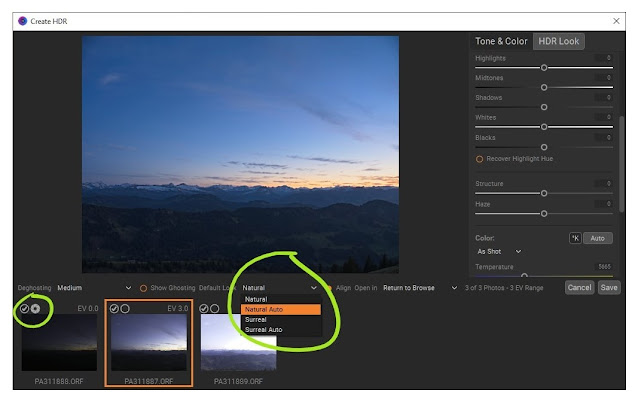
To create the HDR base image, you'll need to select the three images in ON1 Photo Raw Browse and then click the HDR button on the right. You'll now be confronted with a number of choices; Deghosting, Default Look and a bunch of sliders and options.
Deghosting is all about how the programme processes compositional differences between the images, which will play a role if the shot was hand-held or if there are moving elements in the scene. Here neither is the case; the photo was shot from a tripod and there's nothing in the image that was moving sufficiently to cause problems over this distance and time-scale. The orange square reflects which image you've selected as the base image.
 |
Selecting the base exposure and HDR algorithm
|
The next choice to make the
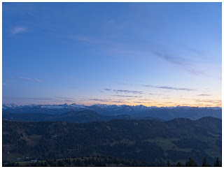
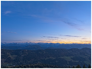
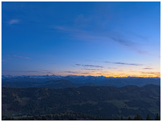
Default Look. This dictates how ON1 processes your images into the final HDR picture. There are four options here; Natural and Surreal, both with and without Auto processing. Just for fun, I've tried all four options here below. The difference between Auto and native is that ON1 chooses how to set the basic level sliders for you.
 | | Natural |
|
 | | Natural Auto |
|
 | | Surreal |
|
 | | Surreal Auto |
|
Because I want the image to reflect the darker mood of blue-hour, the dusk hour after sunset when there's still ambient light to see by, I've set the base image for the exposure using the iris icon in the left-hand image in the HDR window.
Effects and Local Edits
Once ON1 has generated a base image that you're happy with, it's off to the Develop module to do the actual editing. This is where the magic happens and where you can turn a good image into something special. Of course you've still got the option of just hitting AI Auto at this stage for ON1 to perform an automatic edit. If you really want to make the image sing, however, a little more finesse is involved.
Normally if I was editing an image, I would have applied one of a personal custom preset, applying a bunch of Effects and Local Edits to the image. Actually in my custom preset, most of these aren't actually applied, instead they're pre-loaded but not yet selected. This is a huge time- (and wrist-)saver, because it means that I don't have to click through a number of menus items to select the standard edits that I use on most photos. I apply this preset automatically at the import stage, but the output file from the HDR module strips the photos of all these filters.
I used the Natural Auto HDR as my base image as a starting point. Everyone has their own particular style. Mine tends toward the hyper-realistic feeling of
Albert Dros or
Fabio Antenore, two landscape photographers whose eye-catching Instagram images really stuck out to me, but I don't take it quite as far as they do.
Having set the base image using the HDR sliders, it's down to some Effects and Local Adjustments:
1. Base Image
Here's the base image. I've cropped to a 2:3 format to cut out the immediate foreground.
2. Noise Reduction
I hate performing noise reduction. It's process I don't understand and usually involves me randomly sliding Luminance and Detail up and down until I arrive at a compromise I'm happy with. Unfortunately, cameras with small sensors are prone to noise grain. I normally avoid this by leaving the ISO at the native level. Even though I did that here, I seem to have picked up some noise in the sky. I've reached an unhappy compromise here with a Luminance of 40 and Detail 15.
3. Colo(u)r Enhancer: Increase Colo(u)r
Adds some colour saturation to the image, deepening the blue of the sky. I've applied it to the whole scene at 100% opacity except the yellower area of the sky because it became too dominant.
4. Tonal Enhancer: Highlights Darker Darkens the sky somewhat, intensifying the colour even further. Applied to the sky with a gradient mask. There was no need to apply it to the foreground.
5. Tonal Enhancer: Tonal Contrast I Adds a bit of sharpness to the scene. Applied using a large feathered brush at opacity 50% to the mountain area to restore some detail.
6. Tonal Enhancer: Tonal Contrast II
I applied a second, more gentle tonal contrast filter as a gradient at 33% opacity to the bottom of the picture to give the trees a little more detail.
Using the split tone filter you can add different colours to both the highlights and the shadows of an image. Here I've used it as a diagonal gradient with the highlights unaltered (set to white) but the shadows given a purple tone. As you can see it subtly changes the darker blue tones into slightly purple ones.
Note: the purple bottom-left was unintentional and removed in later photos.
8. Local Adjustment: Lighten The foreground was looking just a little too dark for my taste, so I adjusted the Exposure to +0.6, Contrast to +20 and Saturation and Vibrance each to +15. Applied as a gradient to the bottom of the photo.
9. Local Adjustment: Reduce Highlights The orange sky was still a little wan for my taste so I applied a radial gradient to the right-hand side of the photo in which I only pulled the Highlights down to -85. No Exposure adjustment, just the Highlights, it's a neat way of dealing with local Highlight (or Shadow) issues in a photo and here it just enhances the colour in the western sky towards the set sun.
10. Local Adjustment: Lighten
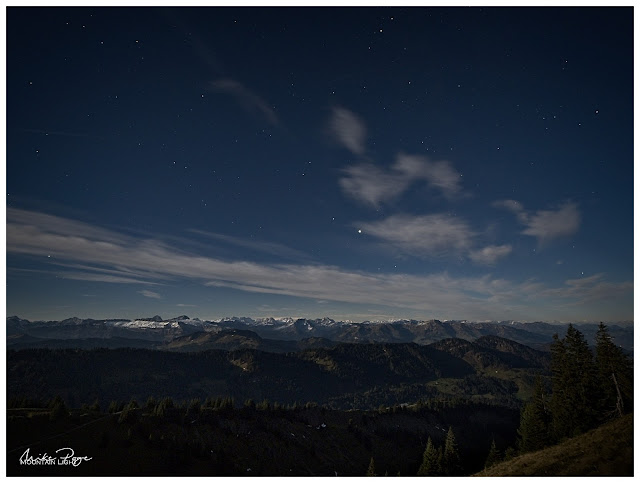
This last step is the salt in the soup and one I'm quite proud of: Instead of decreasing the highlights as one usually does, I selectively increase them - on the snow. Again, the exposure on this edit was left neutral and I just upped the Highlights by +40 and Midtones by +70. Then to rescue the snow a little bit out of the blue tone I increased the colour temperature by 5. This slider is incredibly sensitive at this level, but +5 really brings it enough towards white that it stands out.
Applying this brush wasn't easy and took me several attempts. In the end I opted for the ON1 AI Quick Mask, modified at the micro level along the ridge of the mountains and then removed from the immediate foreground. I love the way that you can set a gradient or mask in ON1 to tell the programme where to apply the effect that you want and then make micro adjustments to that mask to correct any mistakes.
Looking back up the series, the difference between steps is relatively subtle, so before I reveal the finished image, let's look again quickly at the starting point and then immediately on to the final photo for comparison:
 |
| Before |
 |
After: Blue Hour over the Allgäu
|
Anyway, that's the final edit (for now). Let me know below if you've found this helpful at all, or if you'd have done anything differently. Until then, stay safe and happy shooting.
