Showing posts with label post-processing. Show all posts

Monday, 25 January 2021

Some (N)Ice Winter Compositions

Saturday saw us in one of the local gorges looking for compositions in the snow again. In today's blog I go into a lot of detail concerning the thought processes and relevant settings behind each of the images and was pleasantly surprised just how much is going on - a lot of it is second nature. Hope you enjoy.

Beeches and Birches I || Olympus 18 mm, f/8, 1/60 s, ISO 800 
This was essentially an instinct shot - we were walking up the path above the gorge towards the Purschlinghaus - an excellent excursion on another occasion or at another time - and this scene manifested on our right just before a bridge. I made a note of it at the time because I thought it had potential and got this snapshot off. What caught my attention were the silver birch trunks, beech saplings and the stream behind - that you can't really see here. The tones were just so harmonious that they were screaming to be taken. Even though this was an instinct shot and the better composition had to be worked a little (see below), I'm quite happy with this as a stand alone image. Normally I try to stick to the camera's native ISO of 200, but I set it on auto today as it was quite overcast. One of the downsides to higher ISOs, particularly on smaller sensor cameras like mine, is that the image can become unappealingly noisy or grainy. I wasn't too concerned about this happening in the snow, however, as this would mask a lot of that problem.

There's a 2005 German folk song that goes something like this:
"Ob er aber über Oberammergau Oder aber über Unter-ammergau Oder aber überhaupt nicht kommt. Des ist net g'wiss"
- freely translated: "it's uncertain whether he'll come via Oberammergau or Unterammergau, or whether he'll come at all". It does loose something in translation though. What remains is the fact that Oberammergau and Unterammergau both have their own unique charm. Oberammergau, home to the world-famous Passion Play celebrating the end of the 17th century plague by retelling the story of the Passion of Christ, is quintessentially Bavarian but very touristic. It's less well known cousin, Unterammergau, is just 5 km down the road but still very much worth a visit, not least of which for a trip to the Schleifmühlklamm - the whetstone mill gorge. In other times the eponymous restaurant is also worth a visit, though for obvious reasons it's presently closed.

Smaller and less well known that, say, the Partnach or Höhlental gorges in nearby Garmisch, the Schleifmühlklamm is still very much worth a visit and has two or three waterfalls that are a photographer's delight. We'd recently equipped ourselves with ice spikes for our hiking boots and I was also keen to try out my newly acquired Vallarret photography gloves. They're regular winter gloves with removable tips for the index fingers and thumbs allowing camera operation in cold weather. Not cheap, but definitely effective.

Our new Grivel spikes || Olympus 
I want to spend a bit of time in today's post talking about photographic decisions and reasons for certain compositions. The above photo is a great place to start, even though it's pretty much a "B-roll" shot - it was a spontaneous candid and the camera was still in exposure bracketing mode. I knew wanted a slower shutter speed for this shot but also knew that I didn't have time to change to shutter priority mode, select a lower shutter speed, frame up and shoot, so it was literally a grab shot. I had three exposures, 2 EV apart. I could easily have chosen the first shot, though the movement wouldn't have been quite as pronounced. Instead I've gone for the slower, high exposure shot, giving motion blur as well as isolating the element that I want the viewer to be looking at - in this case the spikes. It helps that they're yellow and there are two pairs of them. Normally the eyes drift to light objects in a scene, but this is trumped by contrast. If the whole scene is bright, then the eyes drift to something else, in this case the bright spikes.

The sign at the bottom of the gorge stated explicitly no admittance due to the icy conditions, though the sign turned out to be a little superfluous in light of recent snowfalls. I would definitely not recommend hiking through the gorge in the winter without some sort of grip-enhancer however. There are places that would be impassable if it were icy.

The Stream || Olympus
As we were walking my eye was caught by this slash of stream showing through the snow. Because it had been very cold, ice had formed over parts of the water which had then become covered in snow. This short section of exposed stream caught my eye because it was discrete - closed at both ends - and isolated. The almost parallel lines of the banks, the fact that the whole section was open and not interrupted and the branches giving a bit of texture contrast meant that I couldn't pass this shot up. It's a hand-held HDR - otherwise the water would just have been a black gash or the snow a white gunk. It's got abstract quality, but the branches and leaves anchor it in reality.

Having been here a number of times over the years I knew which spots I wanted to visit in the gorge, but my eyes were open for new compositions as well. Winter changes the landscape as I've mentioned before. Things that work in the summer might not in the winter, messy scenes might suddenly work under a blanket of snow, some vantage points might not be accessible any more and, well, ICE!

Frozen Falls || Olympus 14 mm, f/16, 1/4 s, ISO 200
This is the first easily accessible waterfall - you have to branch right off the path to get to this point. I tried a couple of angles for this shot; there was a snow covered stone standing proud of the water that disturbed me and so I tried a lower angle, but that made the pool at the bottom too thin, so I went for the original composition and stamped the stone out in post. There are a couple of things I really like about this composition; the snow focusses the attention on the main actors, whereas in the summer there is a lot more rock competing for the eye. Also, the rock that does remain provides a nice set of lines pointing to the action. The green of the water and the orange-brown of the rock complement each other nicely and obviously I've chosen a longer exposure to emphasise the motion of the water. The low aperture was partly in order to achieve the desired shutter speed, partly to increase the depth of field. I focused on the rock next to the waterfall. Although it wouldn't ruin the shot if the foreground snowbank wasn't pin sharp, I wanted all the rock and the forest beyond to be in focus. The waterfall was as good as 1/3 of the way into the scene as I could find, plus at 14 mm AND m43, depth of field wasn't going to be an issue here.

Compositionally I could have cropped down to just the waterfall, but I wanted to include some of the environment. There's even a bit of sky at the top of the image, normally a no-no when photographing waterfalls, but a bit more white doesn't disturb the flow. I also tried an HDR version of this shot, but in the end was happy with the dynamic range I was able to winkle out of this single exposure.

Snow Family || Olympus 21 mm, f/8, 1/60 s, ISO1000

My daughter got bored waiting for me to take the previous shot and so made herself a little snowman family.

The next waterfall is tricky, particularly in the winter because the narrow path opposite traverses a steep slope. Finding a good vantage point for the waterfall where I could set up the tripod stably was not easy. Fortunately I wasn't disturbed as I was taking these shots - had I been so I would have had to lift up the tripod out of the way and then set up the shot again.

Upper Falls I: HDR || Olympus 14 mm, f/5.6, 2 s, ISO 200

Upper Falls II || Olympus 14 mm, f/7.1, 2 s, ISO 200
This one's tricky. I ended up taking two images, one landscape, which I cropped to 1:1 and made an HDR image of (top), the other a single exposure in portrait format. Both have things I like about them. In the top image, for example, I really like the rock face and the way the viewer's attention is drawn to the water coming out of a cave almost. In the second shot I like the addition of the green fir trees, the inclusion of the bridge and the symmetry afforded by the waterfall and the gap above it. However, the second image isn't sharp. The snow was soft and I think I must have disturbed the tripod a little.

The climb out of the gorge takes you up a steep path up a series of steps and bridges like the one above. In icy conditions, this would be the impossible bit without spikes. There's a hand rail for assurance for the most exposed parts, but in the snow this was more of a knee rail. The path then comes out on the forest track that doubles as a sledging run in the winter, a trail that we've used a couple of times and is great fun.

Leaving the Gorge || Olympus 17 mm, f/10, 1/13 s, ISO 1600
I've deliberately left this - and many of the other images here - high key, with most of the tones in the light half of the spectrum rather than spread over the whole tonal range from dark as this best reflects the bright scenery in the snow. I love the pale browns and greens with the frosted edges.

Four Friends || Olympus 66 mm, f/10, 1/80 s, ISO 1600
Another instinct shot. I was focussing on the fairy-tale hut in the winter forest and these four sledge enthusiasts passed through, so I grabbed this shot without really checking the camera settings. Not a great deal to say about it. The original was wider, affording a glimpse of the surrounding hilltops, but during processing I thought it might be more intimate to compact it down. Ideally I'd have included a bit more space below the bottom sledge, but, like I say, it was a grab-shot.

Following the path upwards, it was just a question of keeping the eyes open for further images.

Repetitions || Olympus 100 mm, f/4, 1/200 s, ISO 640
What struck me here was the series of repetitive elements. Tessellation is a powerful structural part of images, whether perfect as with man-made structures or natural with imperfections such as here. I had to get in close to isolate this set of branches, hence the focal length of 100 mm - the longest I can go with my 12-100 mm Zuiko lens.

Family Fun || Olympus 13 mm, f/7.1, 1/60 s, ISO 400
The backdrop is what caught my eye here, the various trees in the snow going from the firs behind the people through the brown birches and firs at the top. The family group added a human touch to an otherwise cold scene, accentuated by the bright colours of their clothes.

And then we had to turn home. I was itching to have a second go at the birches and beeches scene as I was sure that there was a strong composition to be had if only I could find the right angle. I wanted to catch the orange of the beech leaves as well as the stream behind, but from most angles I could either have one or the other. Getting closer to the trees let me have more view of the stream, but the thing that had grabbed my attention, insisting that I had a second go at the scene, was the combination of the leaves and the stream. It was a question of getting it all aligned perfectly for a really strong image.

Beeches and Birches II || Olympus 34 mm, f/16, 1/25 s, ISO 1600
This was the third attempt at the scene after I noticed an intrusive stump that you'll see to the left of the very first image. Here I've put more of the stream in the scene - this was what had caught my eye through the leaves due to the similarity in colour. Another consideration here was whether or not to include the base of the trees - something that I'd done in the first shot but not here as I'd gone closer to the trees. Hence the low aperture again. I was focussing on the trees and didn't want to lose depth of field at the log weir at the back. 

Beeches and Birches III || Olympus 35 mm, f/16, 1/30 s, ISO 1600
This was my final image though. Bottoms of trees included and a clear line of the stream leading through the image to the back. An added bonus is the holes in the snow showing the layers of snow nicely. The image has more space with the view through the trees, though perhaps with a bit too much negative space bottom left. What do you think?

I've surprised myself at how much thought goes into each photo in the field. Much of it has become second nature so I don't really think about it - it's almost instinct, but it's definitely interesting to go through the process and analyse what considerations were driving each individual shot. Anyway, I hope you enjoy them and call back next time.

Monday, 14 December 2020

Out and About December

There is (or probably more accurately, was) a trope in exploration films of the last century that the natives would refuse to let themselves be photographed for fear of losing their essence, that the camera would magically capture their soul or 'essence' and leave them somehow diminished. As enlightened people we pooh-pooh such superstitious nonsense, especially the more scientifically minded of us (I have a PhD in biochemistry). But more recently I've come back to this question, from a slightly different perspective. Not that I'm advocating that capturing light reflected from a subject on a sensor in any way takes something away from the scene, but the idea of capturing the essence of something.

At The Castle Gate I || Olympus 61 mm f/6.3, 1/100 s, ISO 250 
It all boils down to the age-old question; what makes a good photo? Obviously there are n+1 answers to that question, where n = the number of photographers asked, and a lot will depend on the genre of photography in question. What makes a good portrait photo isn't the same as what makes a good product, macro, wildlife, abstract, street, sport or landscape photo. I'm not even sure that there's a single over-arching principle that captures what constitutes a good photo for a single one of these genres, but I think that the concept of capturing the essence of the subject comes close. 

The Setting Sun: Composite || Olympus 100 mm f/5.6, 1/320 s, ISO 200
The shot above is a three-shot composite. I hesitate to use the term HDR as it was more a case of exposure blending - manually combining the correct levels of exposure from the three otherwise identical photos instead of a computer (or camera) -generated HDR. Hand-held. The essence of the scene is the setting sun in the context of the ice-covered branches and wintery sky.

A portrait that tells you something about the subject's passions by capturing the person in their environment, a sports photo that conveys the tension of the game, a landscape photo that transports the viewer to the environment and scene in question will always be more compelling than a plain documentary shot. But how do you get such an image?

A Man and His Dog; Rule of Thirds || Olympus 100 mm f/7.1, 1/30 s, ISO 1600
This is where the standard rules of photography composition play a supporting role, but no more - which is all they should ever do (IMHO). The rule of thirds (above, horizontally and vertically), the use of leading lines to direct the viewer's gaze, focus point and depth of field, centred reflections are only ever aids to arriving at decent photos and never a guarantee. It's easy to take a photo that obeys all the rules, but taking a photo that captures the essence of the scene requires something more than following a list of step by step instructions. This is what separates the good from the great.

The Village Oak Tree || Olympus 31 mm f/5.6, 1/60 s, ISO 250
A great question that can help really capture a photo that tells a story is to ask yourself which aspect of the scene really caught your attention. Once that question has been answered, the next one is more technical; how can I take a photo of the scene that accentuates that aspect. Which focal length do I need to use to emphasise the aspect in question? What light do I need to light the scene? Exposure? Depth of field? Sometimes the response to all of these questions is instinctive and you just know as soon as you look at the scene what you need to do, but this instinct requires training. 

The American photographer Joshua Cripps sums up this process with the following analogy: "a good landscape photograph is like a caricature: it simplifies and exaggerates". I think that's a great concept to hold in mind as we as ourselves these questions. In the photo above I've done this partly in post-processing, emphasising the brightness of the snow on the branches. Trees with a low amount of snow on them like this are infinitely more interesting than without, or even with tons of snow on them. What would otherwise have essentially been a high contrast image without the snow - more or less black and light blue, gains an extra dimension.

Winter Evening Personified || Olympus 41 mm f/7.1, 1/80 s, ISO 1250
When looking through my photos from December so far, this was an concept that I had in mind. Which of these photos capture the essence of early winter, that transport the viewer to the scene at the time? Which of them leave the viewer feeling the cold on the end of their nose and tips of the ears? Or hearing the crunch of snow under their feet as they walk the local fields?

At The Castle Gate II || Olympus 23 mm f/7.1, 1/50 s, ISO 1600
My daughter gave me the idea for the shot above as she crouched close to the ground to catch the reflection of the gate in the frozen water. Never be too proud to steal a good idea, or to get your trousers grubby/wet for the cause!

Winter's Morning || Olympus 61 mm f/6.3, 1/100 s, ISO 250
Equally, it's always good to be able to go at the drop of the hat. This wintery sunrise shot was shot pretty much from the front doorstep

Landsberg Christmas Tree || Olympus 11 mm f/3.5, 1/13 s, ISO 250
I love shooting in the blue hour - the hour or so after (or before) the sun goes down. Whether in towns such as our local Landsberg (above) or out in nature catching the first stars whilst there's still enough light to illuminate the mountains. Any earlier for this scene and the Christmas lights would have been overwhelmed by the daylight, much later and there wouldn't have been enough light to see the buildings properly.

Between the Villages || Olympus 61 mm f/6.3, 1/100 s, ISO 250
Another venerable tree, a solitary beech in the fields between us and the next village. Again, the snow on the branches make an otherwise relatively dull subject a lot more interesting. The ploughed field and resulting lines help to add interest and geometry to the shot. In retrospect I should have got a little closer to the tree to get more separation from the tree behind it, but it's not disastrous.

Across the Fields || Olympus 61 mm f/6.3, 1/100 s, ISO 250
I really like winter skies, especially towards the ends of the day. There's often a lot of pink in the clouds even when sunset isn't imminent. This photo was taken just an hour after midday looking south.

A Glimpse of Sun || Olympus 31 mm f/20, 1/15 s, ISO 200
This is a good example of a caricature image. The things that caught my eye were the sunlight twinkling through the tree tops and the snow lying on the downward sloping branches. I deliberately stopped the aperture down to f/20 to achieve the little sunbursts. Combining low aperture with fragments of sun - whether it's just breaking over the horizon, peaking from behind a mountain or behind trees like here lets you get these classical star shapes. Some lenses will give more, others, such as the Olympus Zuiko 12-100 mm here, less, but they still give that classic sunburst. This is another manual exposure blend, one for the sky and one for the forest. The pile of dead wood in the foreground emphasises the snowy branches by repeating the pattern of lines.

Into the Woods || Olympus 18 mm f/8, 1/60 s, ISO 800
Classic leading lines here heading into some local woodland. Exposure bracketed / HDR in order not to overwhelm the shadows and highlights in the final image. The curve of the track really strengthens the image, as do the snowy branches left and right and the upright trunks of the firs at the back. The fact that there's some light at the centre illuminating the trees also helps; the eyes are always naturally attracted to the light. 

Unearthly Glow HDR || Olympus 15 mm f/8, 1/10 s, ISO 320
I really like this last shot. Walking back towards the house through my favourite local woods the low afternoon sun and slight mist caught my eye through the trees. Taking care to hide the direct sun behind a tree I shot an exposure bracket (again, +/- 2 EV), combined as an HDR image in ON1 Photo Raw. The snow on the ground and the high branches (you had to look back didn't you?) really set it off.

So, that's my December photography so far. How's yours going? What weather have you got? Are you able to get out still?

Wednesday, 14 October 2020

The Wooden Bridge: Editing from Start to Finish in ON1 Photo Raw 2020

Once a year, I get together with a German friend that I met on an Olympus camera group on Facebook and we shoot together for a day or two. I say once a year, we managed it for the second year in a row last weekend, but it works so well that we're both adamant that we want to keep going. Both occasions have been incredibly productive photographically, partly as it's normally the only time in the year that I get up to catch sunrise on the Alps from home.

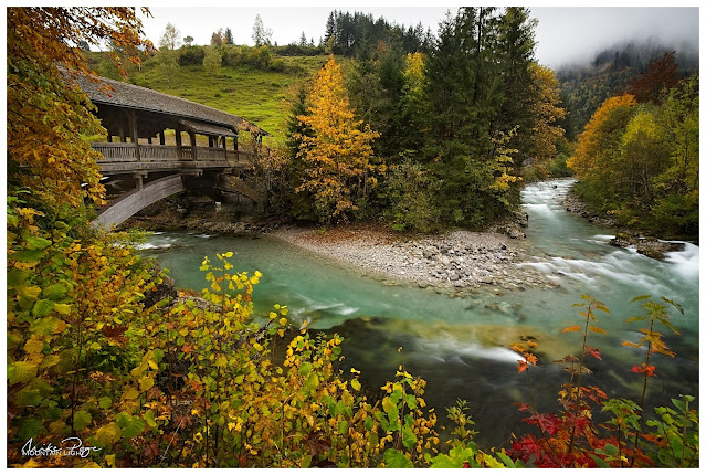
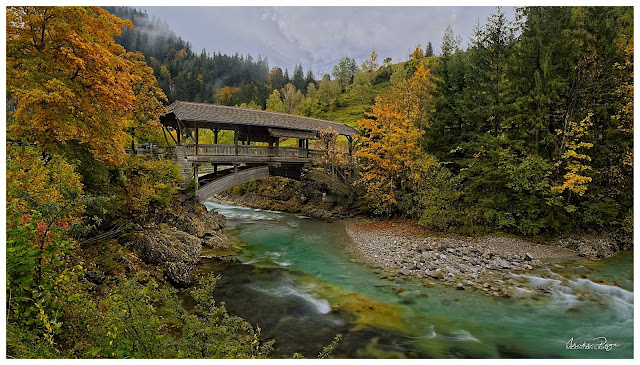
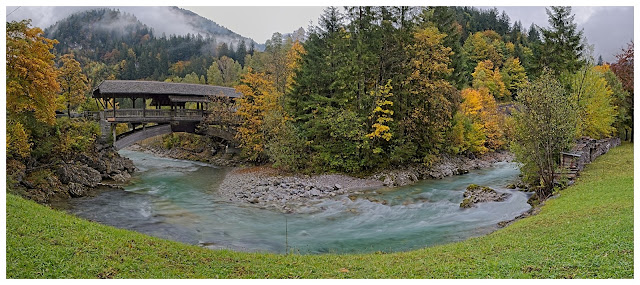
The Covered Bridge || Olympus 8 mm HDR f/8, 1 s, ISO 200 

Last year, we headed down to Füssen and the Stuiben Falls for some epic waterfall shots. This year I wanted to check out a composition that I'd driven past many times but never stopped for and then head to the Zipfelsbach waterfalls at Bad Hindelang. Covid prevented us from entering Austrian Tirol and so we had to stay on this side of the border. There was a chance of a decent sunrise, so I dragged myself out of a warm bed at 5.30 am, grabbed a quick breakfast and coffee before hitting the road. Matthias had driven down the day before and we'd had a productive afternoon in a nearby woods shooting mushrooms and fungi.

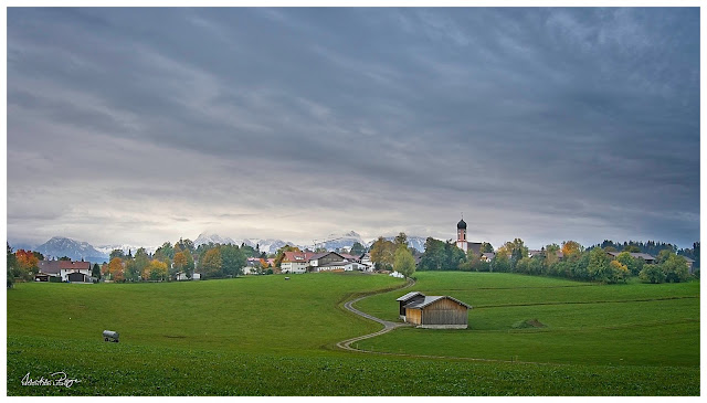
Dawn wasn't a huge success, but we did confirm that the composition was solid: a gently snaking farm track leading up to a village church with the Allgäu mountains in the background. Definitely something to be repeated in better conditions.

Dawn at Seeg || Olympus 8 mm HDR f/8, 1/3 s, ISO 200

The weather wasn't great - I tend to be a sunshine photographer, but Matthias seemed happy enough with the cloud cover. Grey days are great for waterfalls and so we headed down to Hinterstein to check out a location that I'd been to with the family earlier in the year and wanted to spend a little longer at. When we were there in May it was a hike rather than a photo jaunt and I wanted to spend a little longer trying to get some better compositions. Diffuse light is much better than direct sunlight for waterfalls due to the huge dynamic ranges involved - the highlights are really bright and the shadows are really dark, a challenge for any camera.

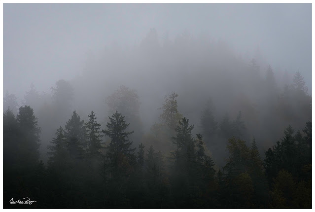
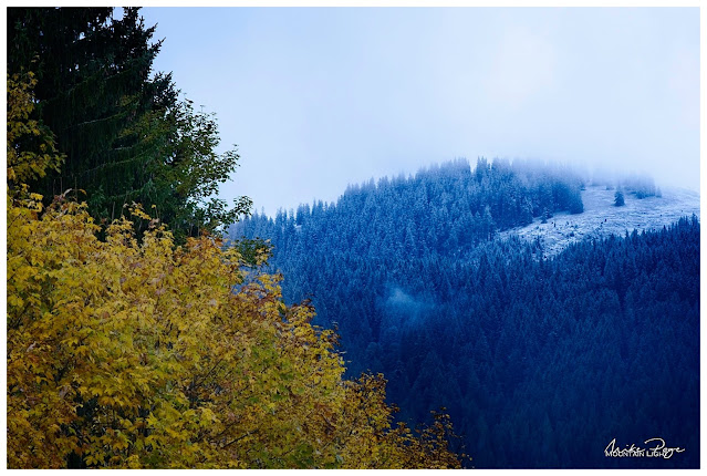
Driving up into the mountains from Seeg, the atmosphere became really moody and we had to actually stop once or twice to get the cameras out and take in the scenes around us, whether the misty fir trees or a hilltop signifying the change of season. It was nice to not have to be going anywhere or getting anywhere, just driving and being able to stop for 10 minutes here and there to take it all in and try to capture the atmosphere around us. I've long been trying to build in the communication of mood into my photos. The conditions made it easy.

Far Over the Misty Mountains Cold || Olympus 100 mm f/5.6, 1/13 s, ISO 200 

Autumn into Winter || Olympus 86 mm f/7.1, 1/5 s, ISO 200
We managed to get a few decent compositions of the waterfalls in the gentle drizzle before heading back down to Hinterstein with a view to finding lunch in the valley. On the road in, we'd noticed a covered wooden bridge on the side of the road and on a whim we decided to stop and check it out. After struggling to find a parking spot in the tiny village we took the cameras and tripods back to the bridge to see what we could find. Very quickly we realised that we'd struck gold. The bridge sits beautifully in the valley with wooded hills behind. The deciduous trees adjacent to the bridge were in good autumn colour and the river colour was a delightful turquoise.

Zipfelbach Waterfall || Olympus 21 mm f/9, 1/2 s, ISO 200


Not only that the bridge sat at the end of a horseshoe bend in the river. It was a bit overcast, but we reckoned we could make something of it nevertheless. We probably spent the best part of 30 minutes working the scene in order to get the best composition before we decided that there wasn't much more that we could do before heading back to the car and searching for an elusive lunch. One of us would spot one compositional element then the other another, walking up- and downstream looking for the best vantage point. From a certain angle you could just make out last night's snow on the hills behind, from another you could block out the road on the other side of the river, from another you could catch the whole river bend and bridge in one shot; it was a real game of cat and mouse to get the right composition. Personally I wasn't overly happy with the light, but I was very smug that once again my nose for a potential composition had proved right.

The Photo(s)

I tried a couple of standpoints along the river, shooting both portrait and landscape, trying to get the snow in and working with and without the grassy bank. Even in the dull-ish light we were having to take multiple shots to get the exposure right, underexposing to get the highlights and re-taking the shot over-exposed to get the shadow detail, a process called exposure bracketing that most modern cameras offer. 

I also used the on-board ND filter function of the camera to slow down the river. Rather than freezing the motion with a single short exposure, it adds a sense of calm to a water photo if you can take a longer exposure, evening out the flow.

Assembling the Panorama Images of the Bridge

On the single shots I also used a circular polariser to cut down the glare on the water, revealing the beautiful colours and stones beneath the surface. Using a polariser can make stitching panorama shots together tricky though, so for the panorama I took it off. Taking a panorama of a scene like this is relatively easy if you follow a few basic rules: 
  • always shoot in manual so that the exposure is exactly the same for all the shots, exposing for the brightest part of the scene
  • if necessary bracket the exposures (see above)
  • focusing manually can help too, making sure that you avoid inadvertently focusing on a blade of grass in front of the camera for the critical middle shot
  • make sure the camera is horizontal before you start
  • overlap each photo by about a third to make the stitching easier
I did a double exposure for each shot, which actually caused me difficulties in the end - I should have done three, but more of that in the processing.

The Edit

I first bought ON1 Photo Raw soon after buying my Olympus E-M1 Mk II in March 2019. Up until then I was using Photoshop Elements as my main processing software, which only allowed me to perform universal edits. I looked long and hard at the market leading Adobe Lightroom, darling of professional landscape photographers all over, but was put off by the subscription-based approach to purchasing the software; you could only rent the software rather than buying it outright, a concept I couldn't warm to. Looking around for suitable alternatives I finally landed on ON1 (pronounced "on one"), a software that started out as a plug-in for Photoshop but which had relatively recently become a standalone product.

In the meantime I consider myself a relatively advanced user; I develop all of my photos with ON1 - with the exception of astro- and lunar photos as the sole image processor - and I think that I have a relatively good grasp of its capabilities.

Nevertheless, this next shot almost cost me my composure. I couldn't for the life of me get it to look how I wanted it, and in no way did it match Matthias' HDR image of the scene. 

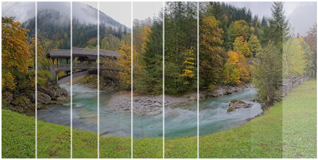
To start with, I had a 9-shot panorama taken at 18 mm (36 mm full-frame equivalent) in portrait. Each shot was double - one light one dark for the sky.

The first step was to stitch each of the two panoramas separately in ON1 and then combine them to get exposure blending. I'd previously done a quick HDR exposure blend of another shot to get a feel for how it might turn out:

Colours are working, but missing the river bend...

The colours of the shot above are relatively pleasing (to my eye at least), as is the tonal range, so imagine my surprise when I stitched my panorama together and got this:

A Pale Comparison

No manner of shifting the white balance and trying to modify the colours would let me get anywhere near this. ON1 wouldn't let me combine the two panoramas for an HDR image. At first I thought it was  because there were only two images and an HDR customarily uses three, but it wouldn't accept the format of the stitched panoramas. So I created a third panorama of the darker series, artificially underexposed it and tried again, with the same result.

In the end, I had to create an HDR from each of the seven panels I ended up using for the final panorama, saving these as information-rich TIFs and then stitching those together to get the final image. Fortunately, this worked, but by this time I'd burnt through the best part of the evening trying to bend the original panoramas to my will.

And the Three Shall Be One!

This is the raw product of the panorama of the HDR images:

Our Starting Point

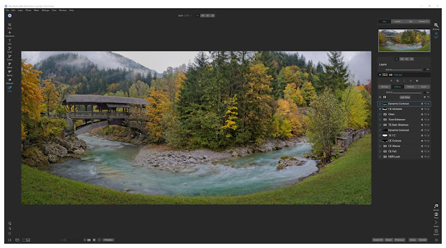
Now the editing can start. I don't generally do much in the way of global edits in the Develop tab of ON1 unless it's to rescue some highlights at a later stage. Most of my editing I do using a bunch of Effect Filters that I pre-load into each image prior to processing using a privately created preset. A preset is a bunch of amendments that you can apply to a photo in one go. I have one with all of my commonly used Effect Filters loaded and ready to go, but unselected. These are (in no particular order):
  • Vignette: Big softy, set at 50% and active
  • Curves: Unmodified but active
The following Filters are pre-loaded but in an inactive state:
  • Tone Enhancer: Clarity
  • Tone Enhancer: Shadows Lighter
  • Tone Enhancer: Highlights Darker
  • Tone Enhancer: Midtones Lighter
  • Tone Enhancer: Tonal Contrast
  • Colo(u)r Enhancer: Increase Colour
  • Colo(u)r Enhancer: Warmer
  • Dynamic Contrast
  • Glow: Angel Glow
Many of these effects could be achieved using the Curves filter, but I find it convenient to process my images this way. Each of the Filters is clearly labelled and ready to switch on at the click of a radio button. In addition, I have four Local Effect Filters charged and ready to go: Darken (-1 EV), Lighten (+1 EV), Dehaze Adjustment and Vibrance Adjustment. The main differences between Effects and Local is that the former are normally applied to the whole image by default and the latter applied locally with a brush and the Local Effects are basically a repetition of the global adjustments of the Develop tab, whereas the Filter Effects go way beyond this.

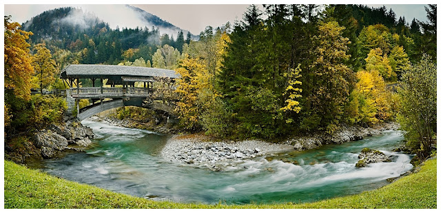
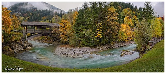
I'll briefly go through all the edits I made to this image together with a quick explanation of why I did it and what part(s) of the image I did it to. The differences between individual images will be very subtle, especially at this resolution, but compare the starting point above with the final image at the bottom and you'll find a very different picture.

Crop

My first step with any image is to crop and level it using the crop tool. Here I just pulled in a bit of the image from each end and lost some of the unnecessary grass in the foreground. At the same time, I stamped out the awkward sapling centre picture and the electric fence by the logs and dulled down the repaired plank on the left of the bridge by locally reducing the saturation.

Colour Enhancer: Increase Colour

Applied just to the river to increase the saturation of the water. Applied using a gradient filter to exclude the trees in the middle as well as the grass in the foreground. Set at 40% opacity.

Tone Enhancer: Darken Shadows

The HDR process took a little too much contrast away, so instead of the usual Lighten Shadows, I used the opposite to bring a bit more substance to the image. Applied globally at 50% opacity.

Dynamic Contrast

There are at least five ways of adding sharpening detail in ON1; Structure in the Develop module or Sharpening, Tone Enhancer: Clarity, Tone Enhancer: Tonal Contrast and Dynamic Contrast. All five do the same or similar things in subtly different ways: they increase contrast in small areas of the image where there are light and dark edges - so-called micro contrast. The theory isn't terribly important, but it's something that should be used with caution. It's easy to add a ton of clarity (generic term, common also to Lightroom) to a picture and it'll look awful.

The different types of sharpening work best for different aspects of a picture. For example, I've found in ON1 that a little bit of Tonal Contrast works really well on adding a bit of detail to forest foliage. Dynamic Contrast, on the other hand, is great at bringing out a bit of detail in wood grain or rocks. In this image I used a masking brush to apply a little Dynamic Contrast to the rocks left and right of the bridge by the water and a little more to the bridge itself.

Tone Enhancer: Tonal Contrast

As mentioned above, a little Tonal Contrast gives a hint of crispness to the edges in forests. I used a radial filter here to add it to the centre of the picture.

Colour Enhancer

Painted in to reduce the saturation and brightness of the grass bank in the foreground whilst at the same time shifting the hue from green towards yellow. The bright green was too dominant in the photo and keeping the eye from progressing to the water and autumn foliage.

Colour Enhancer: Warmer, Colour Enhancer: Fall

Added globally at 100% and 50% respectively to bring out the autumn colours.

HDR Look

I very rarely use this quite strong filter, but here I used it at 45% across the picture to add a bit of brightness to the picture. A Sunshine filter would have had a similar effect, increasing brightness and decreasing darker portions of the photo.

Sunshine

Having mentioned the Sunshine filter, I thought I'd try it out. It adds an extra pep to the image too. Applied at 50% globally.


Glow: Orten

The Orten Effect is an interesting one, again I don't use it often. It adds a sort of ghostly glow that fits a slightly gloomy image like this.


And that's more or less it. I desaturated a tree that looked a tad over-saturated, darkened the grass bank a little more, opened up (lightened) the shadows under the roof of the bridge, lightened the rocks to the left of the bridge and I think that's about as good as I can get it. It sounds like a lot, and it is a lot more than I would do on most images - the easy ones I process in about 2-5 min, but it was necessary and, I believe, worth the effort.

The Covered Bridge || Olympus 7 Shot HDR Panorama


Sunday, 30 August 2020

Tutorial: Exposure Bracketing and Photo Blending

One of the limitations of the digital camera vis a vis the human eye is it's inferior ability to discriminate between dark and light; the average human eye can distinguish approximately 2^20 - or approximately a 1,000,000x difference between darkest and lightest points. My high-end Olympus camera can only discriminate a 7,332x difference - 140-fold less. You've probably noticed when you take photos in high contrast light conditions such as a sunset or any scene where you have very bright parts and strong shadows that you either have a well exposed sky with extremely dark land or a well exposed land with a very pale sky. This lower discrimination power is why. But there are ways for overcoming this. In the days of analogue cameras, photographers would place a sheet of glass in front of the lens that was half smoky, half clear and use the smoky half to reduce the light in the sky. These days, most photographers achieve the same effect by taking multiple photos at different exposures (exposure bracketing) and then assemble them to a single image using software (photo blending). 

This is the final edit of one of my photos of the delightful Dolomitenhütte in the Lienzer Dolomiten that featured in my recent post Osttirol Revisited -  Part II.

The Dolomitenhütte at Sunset || Olympus 50 mm, f/5.6, 1/50 s, ISO 200


Exposure Bracketing

Some cameras, such as my Olympus OMD E-M1 Mk II, allow you to automatically take multiple exposures with varying levels of exposure compensation. One click of the button and the camera will rapidly take a series of three photos, one at the default setting, one with ¼ of the light ("2 stops under") and one with 4x the light ("2 stops over"; a "stop" in photographic terms is always half or double the light/exposure). If your camera doesn't offer this facility, you can almost certainly use exposure compensation (usually a dial labelled E.V. with a scale running from -3 to +3 in ⅓ steps). This is a magical dial that every photographer should be familiar with and using all the time, especially if you're shooting through an electronic viewfinder. Normally you need to do this with a tripod in order to be able to overlay the images 100%.

Exposure compensation scale (orange)


Photo Stacking/Blending

Most modern photo editing software allows you to compile multiple photos as layers and choose what parts of each layer should be visible in the final image. One prerequisite for the process is that the images be essentially compositionally identical, otherwise matching them up can be a pain. Like I say, normally this is assured by using a tripod to fix the camera in place, composing the photo carefully and then manually setting the focus. Normally. Unfortunately I tend to get a bit sloppy with these types of photo and shoot by hand and using auto-focus. 

The real art lies in blending the photos; defining which part of which photo is in the final image. Again, most modern programs offer the option of automated HDR image creation (HDR = high dynamic range, the art of compressing more levels of light into the final image than is possible with a single photo). Alternatively, the process can be done manually by opening multiple photos in layers. I prefer the latter process as it gives me a great deal more control over the final image. Here, the cleaner the edge defining the various layers the better, but invariably there are trees in the photo at the borders of the two layers and these are always a challenge to process. I've chosen a pretty straightforward image here that I manually masked for blending. I'll take you through the process as I do it in ON1 Photo Raw 2020, my photo editor of choice.

We'll start with the basic image, where you can see that the foreground is ok, if a bit dark, but the sky has no character whatsoever, a poor reflection of what we were seeing at the time. 

Native exposure - Olympus f/5.6, 1/15 s, ISO 200

The auto-bracketed shots are 2 stops under- and 2 stops over-exposed. In this example I didn't actually use the over-exposed image as it didn't fit the mood of the scene. As you can see from the under-exposed image, there's a lot more interesting stuff going on in the sky, but if you compare it to the final image, I've taken it even further. 

2 Stops Under Exposed - 1/60 s

2 Stops Over Exposed - 1/4 s

In the ON1 Photo Raw Browser module I select both images and then on the right click on the icon [Layers]. This generates a new image file in the Edit module where both images are simultaneously open. To start with you'll only see the top image, however, so don't be disconcerted. Any time you're working on the image from now on, you'll have to pay attention to which layer you're currently working on and you can click on them at the top of the right hand menu bar. The active layer has a turquoise highlight:

How the layers are displayed in ON1 Photo Raw, the blue circle indicates that the layer is selected (visible)


Masking

So how do you define which bit of which photo appears in the final image? Through an arcane process called masking. Masking defines which parts of a layer are visible (white in our case) and which parts of a layer are invisible (black). But the mask isn't limited to just black and just white, it can also be shades of grey, allowing nuances of layers.

So who tells the program which bits of each layer I want in the final image? Well, you do using masking brushes and gradients. You paint in (or out) the bits of the layers that you want. Clicking on the icon to the right of the layer thumbnail opens a panel giving you access to the masking tools. When you first open it, this panel will be completely white, indicating that all of this layer is visible.

Accessing the various Masking options

There are multiple ways to create a mask from the simple gradient tools, the brush as well as luminosity and colour range masks. Looking at the layer mask that I created for this image, I used the Masking Brush combined with the Perfect Brush option to get a hard edge on the hut itself, together with a slightly softer brush towards the bottom right corner:

Mask for the final image; the Native exposure image is on top, this black and white mask defines which parts of that image are visible over the darker underexposed layer

Ok, so apply that, and what do we get? Certainly a lot more appealing than either of the originals, but still a long way from the final image:

First Blend

So what else do we need to do to get from this to the final? There are a number of steps that I applied to each of the layers in order to really bring this image to life. In ON1 Photo Raw it generally doesn't matter what order you apply the steps in (there are exceptions, but they are too complex for this post. OK, I admit it. I don't know what they are, I just remember watching a YouTube video once where a bloke tried adding the effects in different orders and got different results. There. Happy now?). I don't generally adjust too much in the develop tab at the moment, concentrating almost exclusively on local adjustments

Background Layer (sky and left-hand foreground):
  1. Cropped the image to give a more pleasing cut
  2. Globally added the Effect Filter: Color Enhancer - Increase Color
  3. Locally added a -1 EV Darken adjustment to the sky (gradient mask)
  4. Removed the stray branch top left using the Retouch tool
Foreground Layer (cabin):
  1. Locally added a +1 EV Lighten adjustment with +20 to the shadows and +30 Color Temperature to the area around the cabin lights
These I combined to form a New Stamped Layer (a new layer combining all of the visible parts of the image; right-click in one of the layers and choose this option).

Stamped Layer:
  1. Globally added the Effect Filter: Vignette - Big Softy 50%
  2. Globally added the Effect Filter: Color Enhancer - Warmer 50%
  3. Locally added the Effect Filter: Tone Enhancer - Clarity on the cabin
  4. Locally added the Effect Filter: Tone Enhancer - Tonal Contrast to the forest bottom left
  5. Locally added a Vibrance adjustment to the sky
  6. Other minor dodge and burn (local brightening and darkening) adjustments
And that was it. The first Color Enhancer added a touch of colour to the sky, amplified by the Darken adjustment. The Lighten adjustment with the colour warming added a pleasing glow to the lights in the cabin, even spilling over to the rocks outside. The Vignette focuses the viewer's vision on the central part of the image - I do this to almost all my images - it's part of my personal preset. The Clarity enhancer on the cabin brings out the texture of the wooden slats of the cabin and the Tonal Contrast enhancer brings a bit of definition to the dark forest bottom left - making it a bit less 'mushy'.

And that's it. A lot more editing that I'd normally employ, and certainly a lot more 'dodging and burning', but I think it's worth the effort. End-of-day photos are always a little more challenging due to the lighting conditions. If you have any thoughts or questions on the editing process, do leave them below.

- Dolomitenhütte at Sunset -